Lightweight motion and liquidity-signalling system for Smarkets’ market view, making trading activity legible and felt without redesigning the surface it lives on.
Client: Smarkets
Role: Principal Product Designer
Date: 10-07-2026
Lightweight motion and liquidity-signalling system for Smarkets’ market view, making trading activity legible and felt without redesigning the surface it lives on.
Client: Smarkets
Role: Principal Product Designer
Date: 10-07-2026
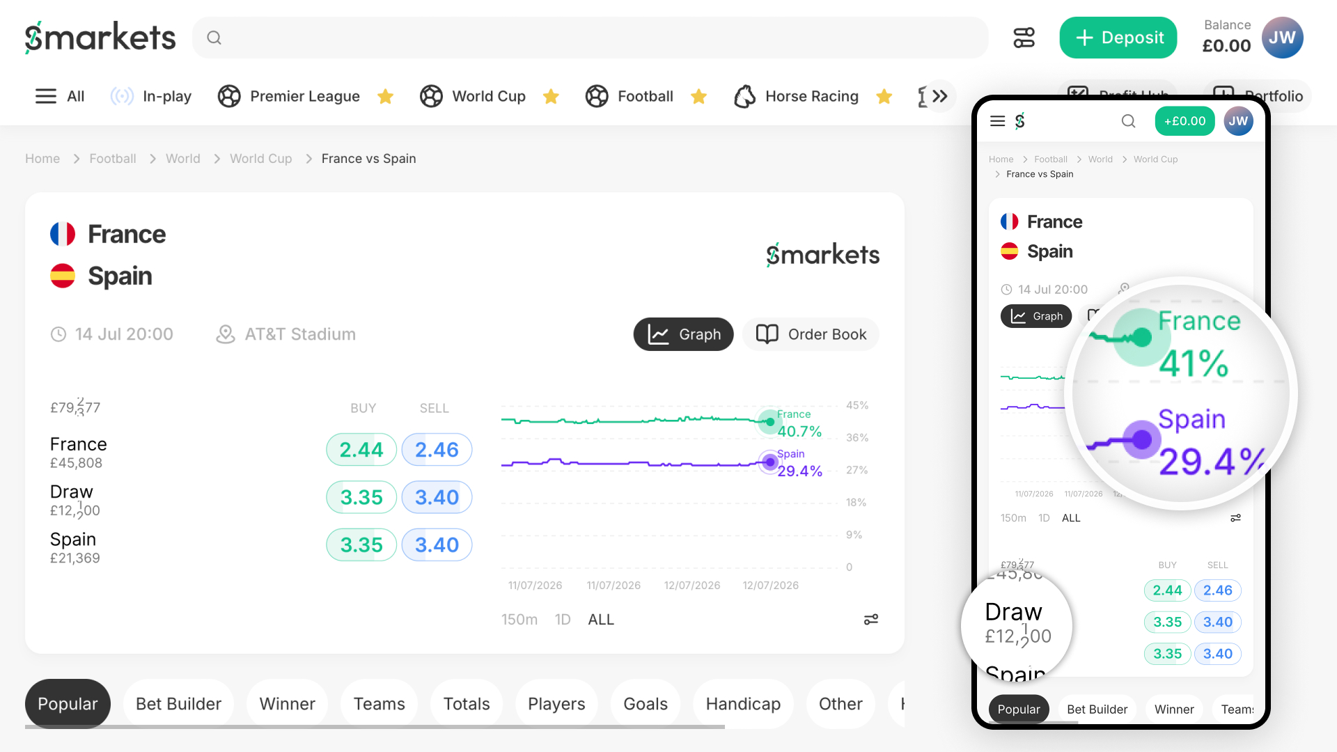
Lightweight motion and liquidity-signalling system for Smarkets’ market view, making trading activity legible and felt without redesigning the surface it lives on.
Smarkets asked for a redesign of their market view, showing prices, matched volumes, order books and graphs. The existing screen felt quiet, reading more like somewhere to take a price than a tradeable market. The task was to make trading activity legible and felt, sharpen the order book, surface momentum and liquidity, and design a one-screen version for both desktop and mobile that served casual traders and serious traders on the same surface, without splitting into two products. Beyond the single screen, the brief explicitly wanted evidence of systems thinking: how the patterns would scale across other markets and views, and how an engineering team would adopt them, plus a visible, honest account of the AI workflow used to get there.
Constraints: Roughly three to four hours of working time, submission within five days, one screen designed for both platforms, and a requirement to show design-system thinking rather than a single polished mock.
Walk into a trading floor. You hear the buzz. Traders are moving, prices are ticking, money is flowing. You feel it immediately.
Markets exist only because people trade them. Remove the people and nothing remains. The feeling of activity and money moving is the truest signal of what a market is.
This isn’t an industry-wide problem. Other platforms manage to show this. Smarkets doesn’t. Right now, a market is happening. Real money. Real people. Real decisions. The interface doesn’t reflect any of it. It shows a price and a graph and calls it done.
The brief asks: “make the trading activity legible and felt.”
Our approach is simple: not a redesign. Subtle animations and lightweight components injected into what already exists, the start of a shared motion language, a Momentum Framework, that future features can draw from rather than reinventing each time. Three additions that work together to create a heartbeat, with the same thinking carrying into gamification, personalisation, or wherever else togetherness as a design idea ends up mattering.
None of these components are new inventions. Candlestick views, live counters, toast notifications, pulsing “live” indicators all exist elsewhere in trading terminals, delivery apps, ticket-booking sites. Jakob’s Law tells us why that matters: users spend most of their time on other products. Familiar patterns get understood instantly. Nobody has to learn what a pulsing dot or a counting number means. We’re borrowing trust, not building it from scratch.
The result: markets that feel alive.
The Problem
The graph sits flat, showing history rather than aliveness. Whether quiet or active, the graph looks identical, offering no visual signal of current activity.
The Solution
A subtle pulsing animation on the graph’s “now” marker. Like a MacBook breathing when it charges, not distracting, not constant, just a gentle indication that the system is watching and ready. The pulse exists whether the market is sleeping or alive. On a dead market, it signals: “The system is real and waiting.” On a live market, surrounded by other signals, it reinforces: “Something is happening right now.”
How It Works
Why It Works
It’s honest. It doesn’t lie about market aliveness. On a sleeping market, the pulse is subdued. On a live market, it sits alongside other signals. Small enough never to distract, present enough that casual observers notice something is real.

The Problem
Smarkets shows total liquidity across a market (e.g. “£78,000 total matched volume on France vs Morocco”). But where is that money? Which outcome is getting the capital? A casual trader sees this number and has no sense of where the money is flowing. A serious trader wants to know: is there more liquidity to buy or sell? Where can I actually get filled?
The Solution: Two Concepts
We’re proposing two approaches. Both solve the problem of visibility. One is simpler and more approachable. One is more powerful for serious traders.
Concept 1: Liquidity Indicators on Buttons
The simplest approach: show broken-down liquidity directly on the existing buy/sell buttons.
Currently:
With liquidity indicators:
The buttons now show odds and depth. A casual trader sees “more people are buying France than selling,” which tells them market sentiment. A serious trader sees exactly where the liquidity is stacked and can make informed decisions about fill likelihood.
Concept 2: Liquidity View (Candlestick Chart)
For serious traders, add a third view alongside Graph and Order Book: Liquidity.
This is a candlestick chart showing buy and sell liquidity over time. Open, close, high, low, but for available capital rather than price. Traders understand this format immediately. It shows:
This is familiar territory for anyone who’s traded stocks or crypto. Simple, powerful, and scales to any market.
The Decision Point
These two concepts aren’t both going in. That’s a choice for product, engineering and data to make together, not one to settle here.
Concept 1 (button fills) fits into existing screens with no new navigation, works everywhere, and doesn’t add a decision a user has to make before they see anything. Concept 2 (candlestick view) is more powerful for serious traders, but adds a third tab alongside Graph and Order Book, another choice before the user gets to what they want. Hick’s Law says more options mean more time spent deciding, which cuts against the brief’s own ask that “insight should surface naturally, not sit a click away.” That’s a mark against Concept 2, not a disqualifier.
My instinct leans toward Concept 1 as the simpler, lower-risk starting point, but that’s a hunch, not a decision. Before either ships, we need engineering’s read on build cost (candlestick liquidity data is a different infrastructure ask to a static fill), and whatever usage data Smarkets holds to tell us whether serious traders would reach for a dedicated liquidity view or whether the fills already solve it. One concept goes forward. The other gets shelved, not “revisited later” as a way of avoiding the call.


The Problem
A market isn’t just about odds. It’s about people. Where are they moving? What are they doing? Right now? The interface doesn’t show this.
You see total liquidity: £78,000. But you don’t see the money moving. You don’t see that in the last 10 seconds, £2,000 has flowed into France. You don’t see that sell-side liquidity on Morocco just dropped by £500. It’s all invisible.
The Solution: Two Approaches
Building on the liquidity work above, we make liquidity changes visible and felt.
Approach 1: Togetherness Toast
When liquidity changes, a small notification pops out of the numbers showing the change. Example: France contract shows £45,000 available to buy. A trader buys £100 of France. The interface now shows:
This works on the contract buttons, on the liquidity view, anywhere liquidity numbers appear. When the market is quiet (sleeping), toasts appear infrequently. When the market is live (game in progress), toasts appear constantly, creating a sense of activity and momentum.
Approach 2: Togetherness Ticker
A more subtle alternative: instead of toasts popping out, the liquidity number animates.
France contract shows £45,000. A trader commits £100. The number counts up: 45,000 to 45,100 (over 500ms). It’s animated, not instant. You see the money flowing in.
When multiple trades happen at once, you might see multiple digits changing simultaneously. It’s like watching a stock ticker, the numbers are moving, and you feel the pulse of the market.
The Call: Ticker Over Toast
Unlike the liquidity concepts above, this one I’d take a firm position on. Toast is the more common pattern, and it’s more explicit: you see exactly what changed and by how much. But toasts cost real estate, and on a screen already carrying odds, order rows and liquidity numbers, a toast risks sitting over information the user needs at the exact moment they need it. On a platform where real money is moving, a toast that overlaps a price creates room for a user to misread what they’re looking at, or to screenshot a moment where the overlay makes numbers look like something they weren’t. That’s not a risk worth carrying for a nice-to-have animation.
The ticker doesn’t have that problem. It never covers anything, because it is the number, just animated. It’s smaller, cheaper to build, and works identically regardless of screen size or how much else is on screen. It leans on the Von Restorff effect the same way toast does, a number that’s counting stands out against numbers that are static, without needing to sit on top of anything else to do it.
Ticker goes forward as the recommendation. Toast gets documented and shelved, not because it’s a bad idea, but because the ticker solves the same problem with less risk and less cost. Small enough not to need a big rollout story, but real enough that it should go through a proper internal PRFAQ before it’s built, so engineering, data and product can all weigh in.


Living Pulse: The system is real and watching. Liquidity Indicator: Here’s where the money is. Togetherness Ticker: Money is moving right now.
On a sleeping market (event hours away):
On a live market (event in progress):
On a fast market (final seconds before outcome):
Principle: Subtle Over Spectacular
These aren’t flashy animations. They’re subtle signals that:
This restraint isn’t just taste, it’s Miller’s Law in practice. Every extra number competes for the same limited working memory. If someone forgets what they were trying to do because the screen asked too much of them, they never trade at all. The goal was never to add more information, it was to make the information already on screen easier to feel.
What This Is NOT
What This IS
Each component exists in multiple states and scales across market types:
| Component | Sleeping Market | Active Market | Intense Market |
|---|---|---|---|
| Living Pulse | Gentle, background pulse | Subtle pulse alongside trades | Pulse continues, steady |
| Liquidity Indicator | Shows available depth | Updates as trades happen | Updates constantly, high velocity |
| Togetherness | Sparse signals (trades rare) | Regular signals (trades frequent) | Dense signals (overlapping) |
This same pattern holds whether you’re watching France vs Morocco, a correct score market, a political prediction, or an esports match. The components are agnostic to domain.
A strong initial feature set only proves itself if we can point to a number that moved. Here are the three metrics worth tracking, why each one maps to a specific component, and how we’d track it.
1. Basket-adds during low-urgency windows
Hypothesis: When an event is genuinely quiet, hours out, no live action, nothing time-sensitive, Living Pulse and the Liquidity Indicator will still drive contract adds, because the market feels real and worth acting on even when nothing dramatic is happening.
What we’d track: Rate of “add to basket” actions per active viewer, filtered specifically to pre-event windows where trading volume is historically low (e.g. the 24 hours before a fixture, excluding the final hour). Compare this rate before and after the components ship.
Direction we expect: Up. If Living Pulse is doing its job, quiet markets should convert at a noticeably higher rate than they did when the interface gave no signal of life at all.
Timeline: Daily tracking for the first 30 days post-launch, compared against the same pre-event windows for the prior 30 days. This is a slow-burn metric, quiet periods don’t generate much volume, so a 7-day read will be noisy. 30 days gives enough events to see a real pattern.
2. Fill rate and time-to-fill on contracts with visible liquidity
Hypothesis: Once liquidity is visible on the buy/sell buttons, users will respond to scarcity, contracts showing thinning liquidity will get filled faster, and users will be more decisive when they can see depth rather than guess at it.
What we’d track: Time between a user viewing a contract and completing a trade on it, segmented by whether that contract had low, medium or high visible liquidity at the moment of viewing. Also track: did showing liquidity increase the proportion of users who complete a trade after opening the buy/sell panel (panel-to-trade conversion), versus abandoning it.
Direction we expect: Time-to-fill down, panel-to-trade conversion up, particularly on low-liquidity contracts where scarcity is real and now visible rather than hidden.
Timeline: This is testable fast. A/B test with liquidity indicators on vs off, run for 7 days minimum to get statistical confidence, extend to 14 days if traffic is thin on the specific contracts being measured.
3. Second transaction rate within a session
Hypothesis: Togetherness signals (the ticker, per the recommendation above) create a sense of ongoing momentum, seeing other trades land should make a user’s own first trade feel like joining something active, increasing the likelihood they place a second trade in the same session rather than trading once and leaving.
What we’d track: Of users who complete one trade in a session, what percentage go on to complete a second trade in that same session, before vs after Togetherness ships. Also worth watching: average session length for users who see the components active (live market) vs those who don’t (quiet market), to separate “more trades” from “just more time on site.”
Direction we expect: Up. This is the metric most directly tied to Smarkets’ commercial interest, repeat engagement within a session is a leading indicator of a user becoming a habitual trader rather than a one-and-done casual.
Timeline: Track on a 1-day basis (session-level data resolves fast) but report weekly, and hold a 90-day view to check whether the early lift is a novelty spike that fades or a genuine behavioural shift.
How These Three Fit Together
Each metric is deliberately tied to one part of the system, not the whole thing at once, so if something moves, we know which lever moved it:
| Metric | Primarily tests | Signal it validates |
|---|---|---|
| Basket-adds in quiet windows | Living Pulse | Aliveness alone drives action, even without urgency |
| Fill rate / time-to-fill | Liquidity Indicator | Visible scarcity changes trading behaviour |
| Second transaction rate | Togetherness | Momentum signals build session-level habit |
If all three move in the hypothesised direction, that’s a strong case the full system works as intended. If only one or two move, that tells us which component is pulling weight and which needs rethinking, rather than treating the whole initiative as one undifferentiated bet.
Every one of these signals could cut the wrong way. Worth stating plainly, and worth measuring, not just acknowledging.
Liquidity Indicator: scarcity could read as a warning, not an invitation. The instinct behind this component is that seeing thin liquidity creates urgency, act now or miss it. But the same signal could just as easily read as “this market is thin and untrustworthy,” particularly to a casual trader who doesn’t have the context to know that low liquidity on a quiet contract is normal, not a red flag. We’d be trying to create FOMO and accidentally creating doubt instead.
How we’d measure it: Segment the panel-open-to-abandon rate (opens the buy/sell panel, then leaves without trading) by trader type, first-time or low-volume users versus users with a longer trade history. If abandonment on low-liquidity contracts rises specifically among casual traders after this ships, that’s the counterfactual showing up in the data, not urgency, but hesitation.
Kill criterion: If casual-trader abandonment on low-liquidity contracts increases by a meaningful margin against the pre-launch baseline and doesn’t recover within the first 30 days, the component gets pulled back to design, most likely gated so it only surfaces for users with trading history, rather than shown to everyone by default.
Togetherness Ticker: constant movement could read as noise, not energy. On a genuinely fast-moving market, numbers counting up and down every few seconds could tip from “this feels alive” into “this feels chaotic,” especially for a casual trader trying to make a simple decision. Miller’s Law cuts both ways here, the component designed to draw attention could end up overloading the exact working memory we said we wanted to protect.
How we’d measure it: Watch time-on-page and rage-click or erratic-scroll signals (if available) on high-frequency markets versus low-frequency ones. If casual traders leave faster or interact less cleanly on the loudest markets, the animation frequency needs a ceiling.
Kill criterion: If session abandonment correlates with update density above a certain threshold, we cap how often the number is allowed to visibly animate (e.g. batch small updates rather than animating every single trade) rather than reflecting every trade individually.
This part can’t be skipped. It’s easy to ship a feature because the story is good. It’s harder, and more valuable, to build in the exact conditions under which we’d admit the story was wrong and take it back out. If a component doesn’t move its metric, it doesn’t get a permanent home just because it was clever to build.
What’s here is high-level concepts grounded in real behavioural principles. A deliberate starting point, not a finished system. Getting from here to something shippable means:
Instrument before building further. The three metrics above only work if the tracking exists from day one, basket-adds during quiet windows, time-to-fill, session-level second transactions. None of this is retrofittable cleanly. If Living Pulse ships first as the low-risk starting point, its event tracking should ship with it, even before the other two components exist, so we have a clean before/after baseline rather than guessing retroactively.
Break these down into reusable components and animation patterns. Living Pulse and the ticker need to exist as proper design system primitives under the Momentum Framework, not one-off screens. Defined states, defined tokens, defined motion specs that engineering can pick up and reuse anywhere. The liquidity concept still needs its effort/value conversation with product and engineering before either version gets built.
Sit down with product and engineering on effort. Some of this is trivial (a pulsing dot is a CSS animation). Some of it is genuinely hard (a live-updating candlestick view of liquidity is a real data and infrastructure problem). We need their read on what each of these actually costs before ranking anything.
Build an effort/value matrix. Once we know the cost side, we can weigh it against expected impact and agree what gets built first. Living Pulse and the liquidity button fills are the obvious low-effort, high-visibility starting points. The candlestick view is the one that needs the most validation before committing engineering time to it.
Test properly against Hick’s Law, Miller’s Law and the rest. These principles shaped the direction, but they’re hypotheses until they’re tested on real users. Does the liquidity view actually cause hesitation once we know which concept ships? Does the ticker’s update frequency ever tip into noise? That’s usability testing, not guesswork.
Expand across the wider market universe. This case study focuses on a single football match because that’s what the brief gave us, and three to four hours doesn’t stretch further. The real test is whether these components hold up outside sport. Smarkets isn’t only a sports platform, and neither should this system be. The next phase is proving these patterns are genuinely contract-agnostic.
Prediction markets live in a tension: they need casual traders for scale and volume, and serious traders for liquidity and depth. Most platforms pick one and under-serve the other. Smarkets is trying to hold both.
These three components don’t force that choice. They layer information so:
The interface doesn’t shout. It whispers, and lets traders lean in if they want more.
That’s how you build trust in a market. Not with hype. With visibility.
None of that changes the fact that this is a starting point. The trading floor we opened with, loud, busy, visibly full of people, isn’t built by three components shipped once. It’s built by treating movement and togetherness as a standing part of how Smarkets designs everything that comes next. This case study is what that looks like on day one.