Transforming a basic Shopify store into a multi-million pound revenue machine for one of the UK’s most-watched shows by listening to users.
Client: ITV
Role: Lead UX Designer
Date: May 2019
Transforming a basic Shopify store into a multi-million pound revenue machine for one of the UK’s most-watched shows by listening to users.
Client: ITV
Role: Lead UX Designer
Date: May 2019

Love Island was one of the UK’s top shows, drawing almost 4 million viewers in season 4. Commercial opportunities were obvious (a merchandise shop and sponsor partnerships were already in place), but the numbers weren’t adding up. Sponsorship deals felt underweight and ecommerce sales were negligible against the size of the audience. We inherited a basic Shopify store with Love Island branding and set out to transform it.
The shop was already live and already making sales, so the platform was non-negotiably Shopify. Our job wasn’t to build from scratch, it was to find what was silently bleeding revenue and fix it. Three friction points emerged, each one invisible to the business until we looked.
HotJar session recordings showed thousands of users reaching the payment details stage and leaving. For logged in users, I contacted them directly and asked why… they all gave the same answer; they didn’t have a credit card, only a debit card. Shopify’s default field label read “Credit card number” – a product of its American origins. Older users were taking it literally.
Solution: I changed one label, the checkout drop-off collapsed and sales flowed.
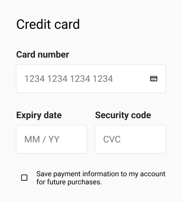 US: Copy Problem US: Copy Problem |
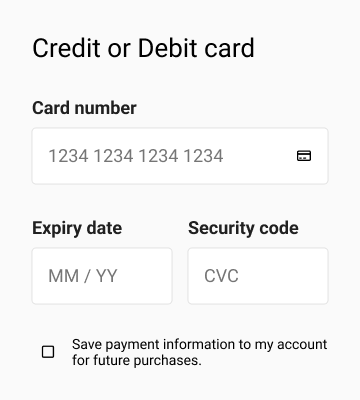 UK: Copy Solution UK: Copy Solution |
Facebook retargeting data showed an excessive number of users who had visited their cart but never reached checkout. Google Analytics confirmed the pattern skewed heavily toward older devices. I pulled the QA device box and found the culprit immediately: on older handsets, the native app’s bottom navigation bar was floating directly over the “Checkout” button in the cart. Users couldn’t tap what they couldn’t see.
Solution: I sat with the dev team, proposed reducing the WebView height by the exact height of the bottom nav, and prototyped it in Sketch Mirror on the QA devices to convince the design director. It worked.
 Problematic WebView Problematic WebView |
 WebView Proposal WebView Proposal |
The islanders carried water bottles with their names on them. Viewers wanted to feel connected to that world and the personalised water bottle was the most direct way in. We already sold the bottles. The problem was that typing a name into a text field and buying it blind wasn’t enough – we could inspire users by showing their name on the bottle before they’d commit.
Solution: I designed a live preview that updated the bottle label in real time as users typed. Sales boomed.
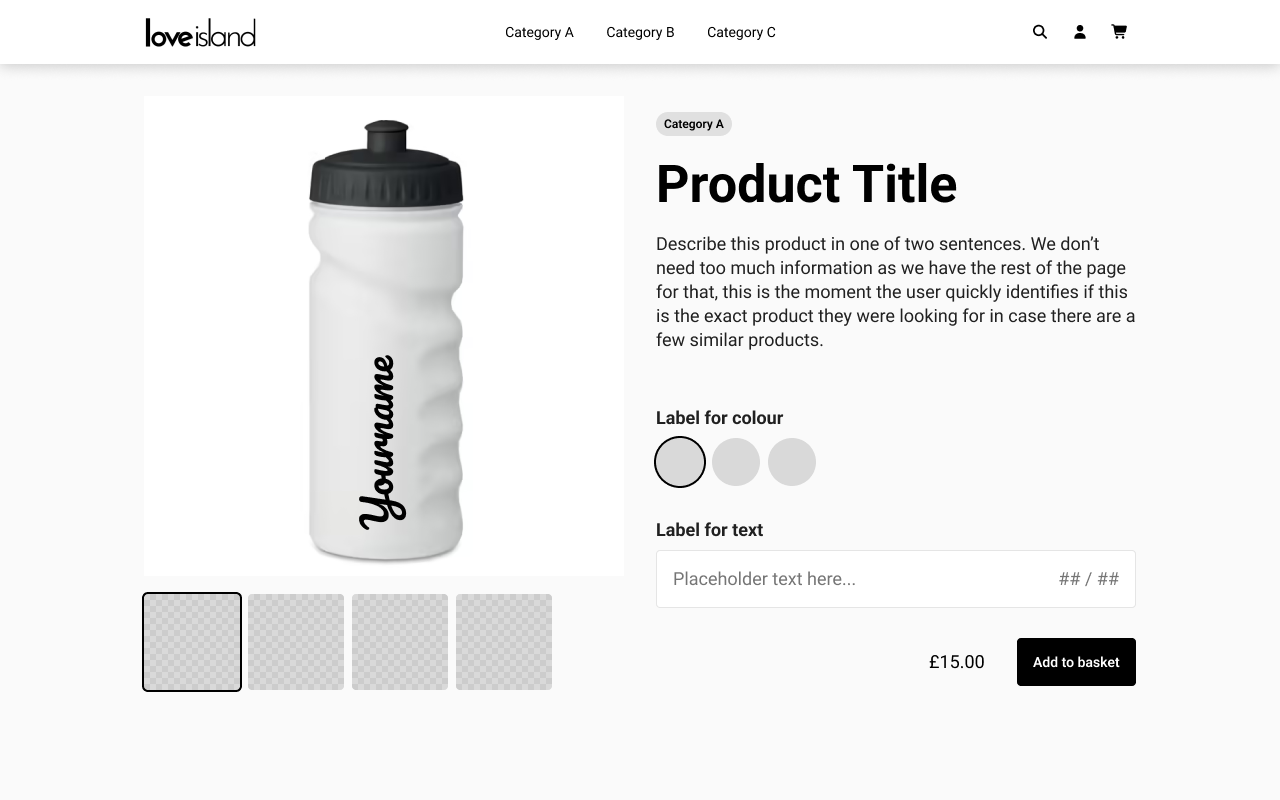
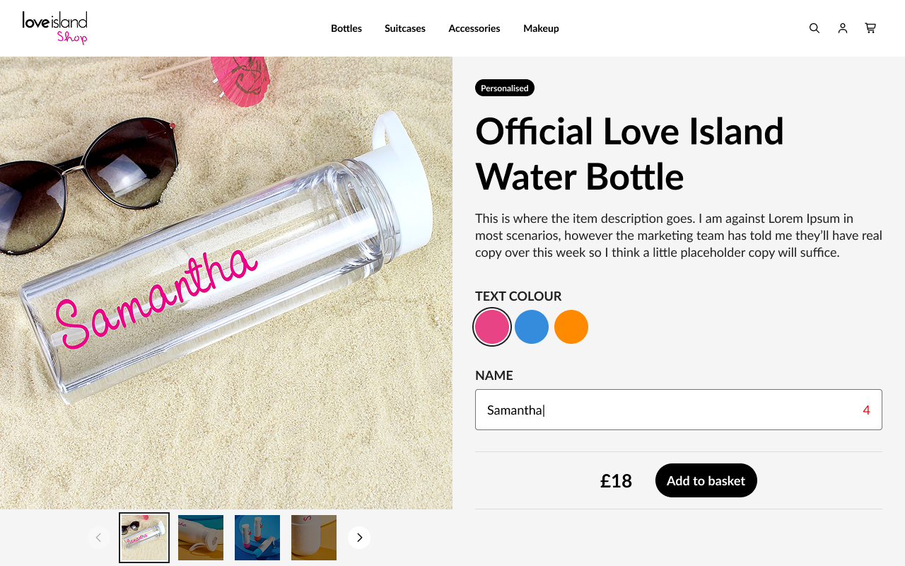
Three separate problems, one diagnostic approach; find where users stop, understand why, clear their route. The underperformed because invisible friction was quietly costing sales. A label change. A layout fix. A live preview. None of it required rebuilding Shopify or big features – all of it required listening to users and accommodating their thinking.